Aura Skincare
IDENTITY
Visual Identity
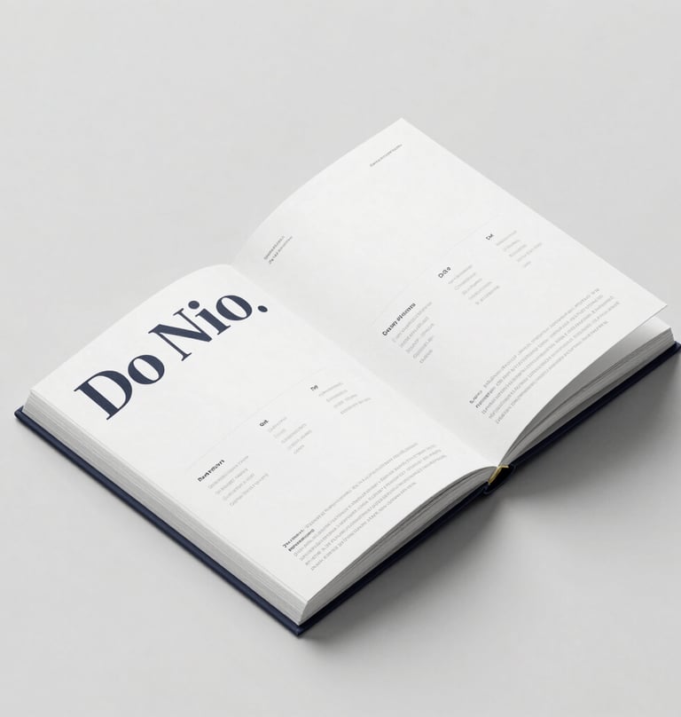
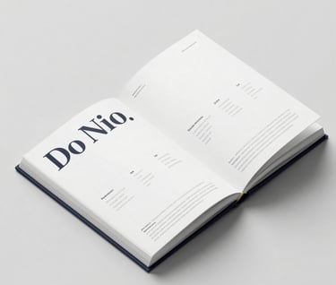
Print & Design
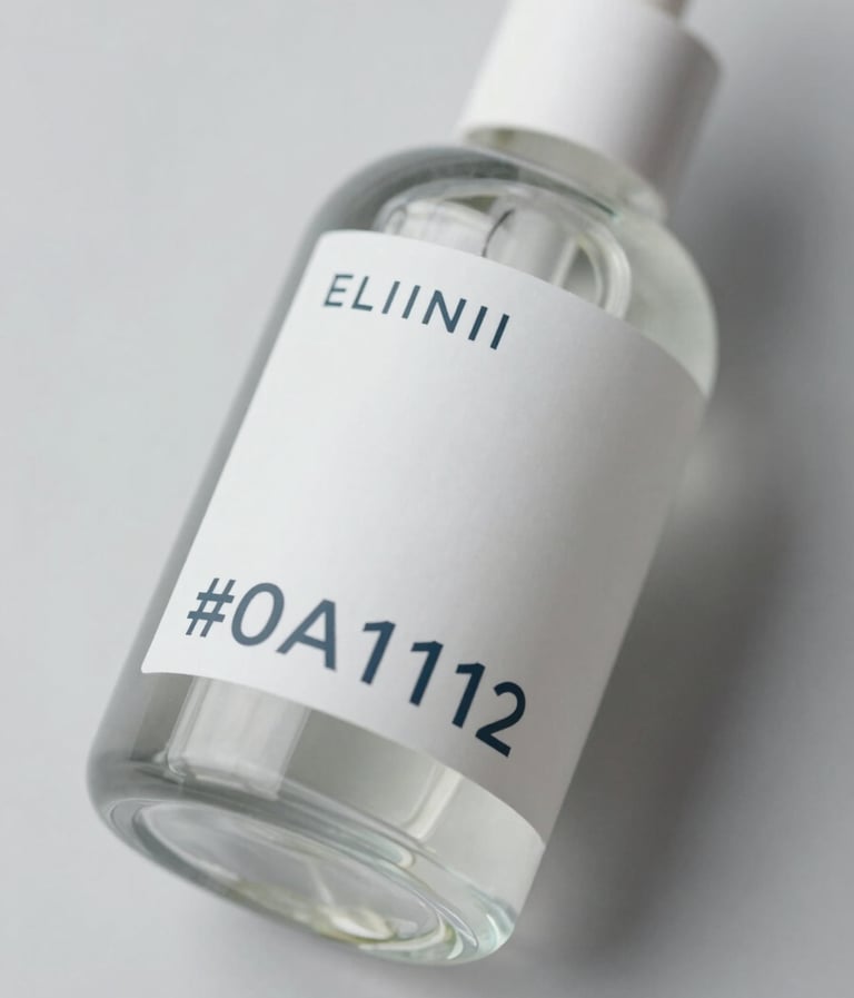
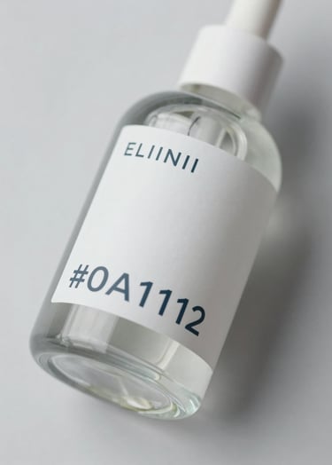
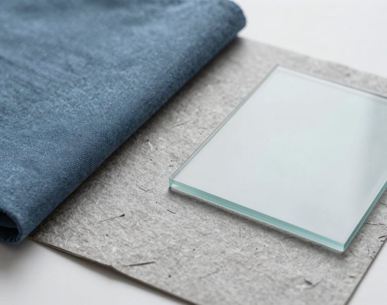
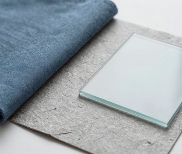
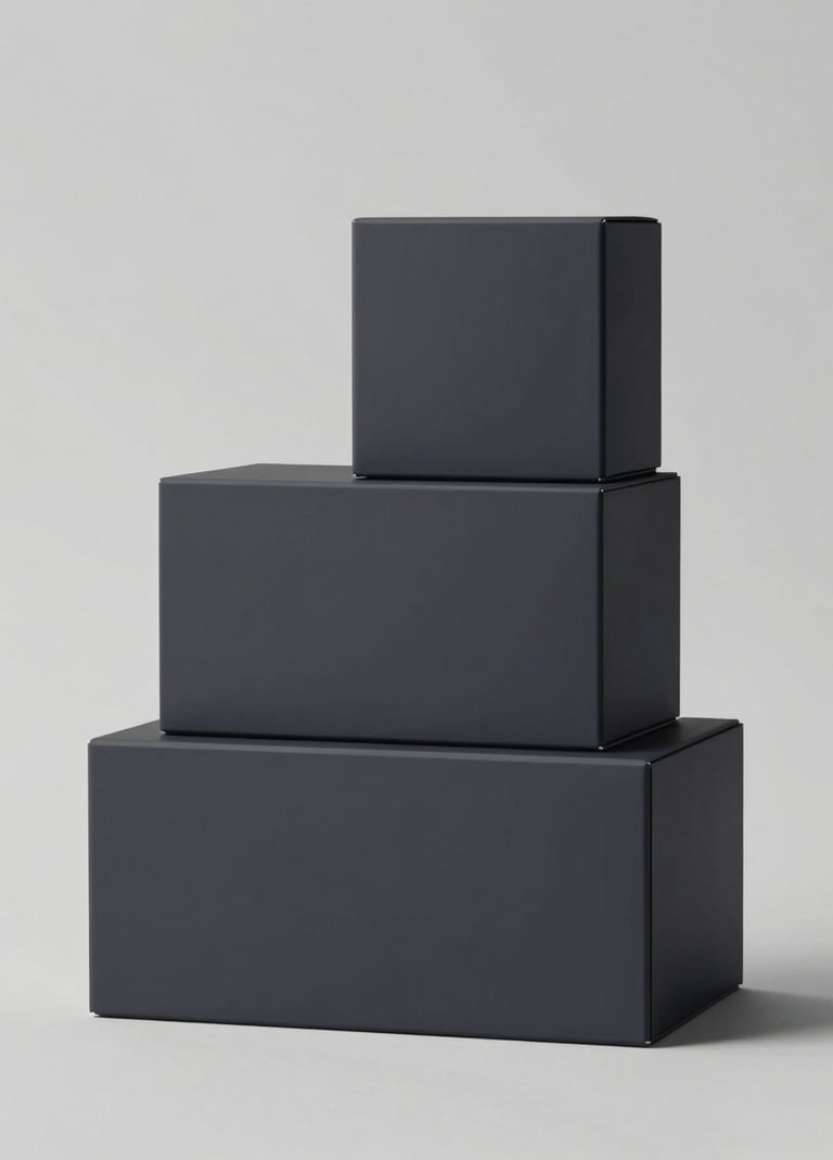
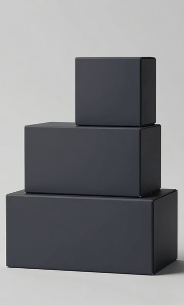
Premium Packaging
Aura is a luxury skincare brand rooted in botanical purity. Our challenge was to craft a corporate identity that balances clinical precision with organic warmth. Using sustainable materials and a refined typographic system, we developed a brand language that resonates with the 2026 conscious consumer.
LET'S TALK →
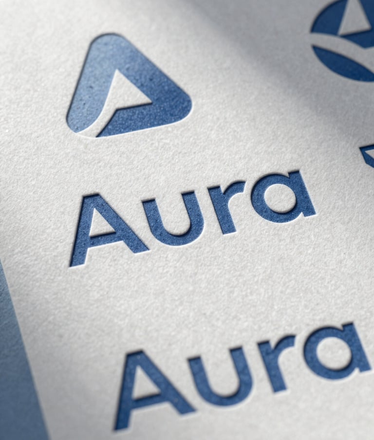
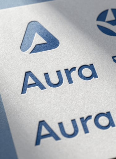
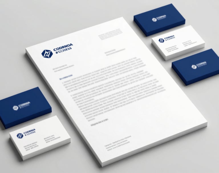
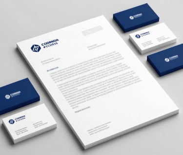
Meticulous alignment and a strict typographic hierarchy define the brand.
We prioritized sustainable materials and tactile finishes.
CRAFT
Our comprehensive design approach ensures a seamless transition from digital concept to physical shelf presence.